Thursday, 28 July 2011
Mark Napier: Shredder 1.0
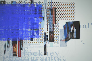
Mark Napier created Shredder in 1998. Its aim was not to appropriate from the web, but to emphasise the materiality of the web. Napier cites Pollock and Smithson as inspiration as both call attention to the materiality of there art. Napier explains his approach: “I wanted to expose the raw material that make up the ‘design’, ‘content’ and ‘information’ of the web and use of information directly. Of course, this material is a construct of software and the graphics display. It is ‘raw’ only by virtue of the context The Shredder creates” (Green, R., 2004 p.100).
“What we see when we browse the web” argues Tribe and Jana, “is a carefully designed veneer, an orderly facade that conceals the jungle of the code” (2007 p.70). Napier’s Shredder 1.0 “lets us peek behind the curtain, revealing a colourful jumble of text and images” (2007 p.70)..
When you visit the site you are encouraged to enter a web address in the location field at the top of Shredder 1.0’s interface and Shredder literally deconstructs the original site. The result of the dicing and slicing of the web pages is an abstract composition.
There is a similarity to here to Photosynthing in that it deals with the DNA of the visual. It does sometimes disrupt an image.
The results of The Shredder are closer to abstraction and abstract expressionism in particular. I have seen examples that look like Hoffman.The reference to the materiality of the web seems close to modernisms idea of honesty of materials.
References:
Greene, R., (2004) Internet Art, London: Thames and Hudson
Tribe, M., (2007) New Media Art Los Angeles: Taschen
Thursday, 14 July 2011
Tuesday, 12 July 2011
Joiners
I have written a lot about a number of practitioners that can be described as “joiners”. This is a term I discovered in John A. Walker’s invaluable dictionary of art: Glossary of Art, Architecture & Design Since 1945 Third Edition. My copy was withdrawn from Beverly Hills Public Library on North Rexford Drive, Beverley Hills.
Anyway, back to the business of “joiners”. This is a term, Walker says, that was:
Anyway, back to the business of “joiners”. This is a term, Walker says, that was:
invented by the British artist David Hockey to describe those of his works produced in the 1980s which are composed of a series of small photographs joined together. The photographs are taken from different viewpoints and then arranged so they link up or overlap with the result that the finished collage resembles a photographic version of cubism. Due to his fame, Hockney has come to be regarded as the inventor of this form of art but in fact artists such as Jan Dibbets and John Stezaker were making ‘Joiners’ long before Hockney.
I would also add Gordon Matta-Clark to the list. Matta-Clark is refered to in the same breadth as Hockney by Zelnik-Manor and Perona,in 2008 in there discussion of automatic-joiners, produced through software.
Other key figures I think are important to mention are John Harper, Luo Yonglin, Thomas Kellner and Sohei Nishino.
There is also Doug and Mike Starn and image joiners like Christopher Marclay that may tie in here.
Further reading:
Hockney, D., & Joyce, P., Hockney on Photography: conversations with Paul Joyce, London: Jonathan Cape
Zelnik-Manor & Perona (2008) ”Automating Joiners”
http://webee.technion.ac.il/~lihi/Publications/ZelnikPerona.AutoJoiners.pdf
http://webee.technion.ac.il/~lihi/Publications/ZelnikPerona.AutoJoiners.pdf
Labels:
David Hockney,
Gordon Matta-Clark,
Jan Dibbetts,
John Stezaker
Jan Dibbets: 2
Dutch artist Jan Dibbets made these photo collages for the Musée Zadkine in Paris in 1994. The use of photography by Jan Dibbets, it is argued, “is abstract” or “rather non-realistic” (Fuchs and Moure, 1991 p.13). This is “because it does interrupt the visual process of perception by imposing precise forms” (Fuchs and Moure, 1991 p.13). The aim of these photoworks is “to ‘deconstruct’ the consistent appearance of visual space conventionally represented in photography”, by multiplying viewpoints, fragmenting exposure times and grading shades of light” (Fuchs and Moure, 1991 p.181).
Sources:
Fuchs and Moure, (1991) Jan Dibbets, Interior Light: Works on Architecture 1969-1990 Barcelona: Ediciones Polâ ̧grafa .
Fuchs and Moure, (1991) Jan Dibbets, Interior Light: Works on Architecture 1969-1990 Barcelona: Ediciones Polâ ̧grafa .
Monday, 11 July 2011
John Stezaker
John Stezaker once said “so much emerges from what I destroy” (Buck, L., 2011 p.36). This could have come from the mouth of Gordon Matta-Clark. Stezaker’s collages seem to come out of the surrealist imagination: they are fragmentary and dream-like and created from found images. These dream-like and unsettling narratives drew from film stills, glamorous publicity shots from the golden age of Hollywood and postcards.
John Stezaker Untitled (For Angus) Film Still Collage II, 2009
Old Mask IV 2006
Mask XXXV, 2007
Carla Sorell notes that “in the Mask series old portraits are mixed with found postcards, placed precisely over the face in such a way that the void created by the landscape become somehow representative of the subjects psyche” (Sorrell, C., 2011 p.21).
Sources:
Buck, L., (2011), “So much emerges from what I destroy” Art Newspaper 20 No220 Jan 2011 p.36
Sorrel, C (2011) “The Face Beneath” Crafts no228 Ja/F p.20-21
Labels:
Collage,
John Stezaker,
photographic joiners,
photography
Doug and Mike Starn
The Starn Twins’ artworks are “not appropriation photographs designed to deconstruct- or expose the context in which the original art was made” (Papadakis, 1989 p.61). The objects produced are “drained of its original significance” (Papadakis, 1989 p.61). Doug and Mike Starn’s work seem to be part of the so lat century, millennium burnout. The two have so “internalized post-modernism as to be virtually free of it, liberated, that is, to the exercise post modern license without being over determined or terrorized by its ideological excess” (Wheeler, 1991 p.335).
Still Life 1983
The Building 1985
They do recycle art history, like postmodernism but they offer something more positive and “more humanistic” with “richer imagery that elicit feeling and fantasy” (Wheeler, 1991 p.336). Doug and Mike Starn’s work is made up of “elaborately layered collages cobbled together with Scotch Magic Tape” (Wheeler, 1991 p.336).
Rookery 1985
Double Stark Portrait in Swirl 1985-6. Toned silver print with tape, 8'3" square.
The fragmented results are fascinating like a “photographic Cubism with the geometric patterning of the individual sheets of paper, fracturing and distancing the underlying ‘picture’ in much the same way that the lambent planes of an Analystical Cubsim jostle a representational world that supposedly lies beneath” (Papadakis, 1989, p.61).
Triple Christ toned silver print with Scotch tape, aluminium, wood, glue and glass 1986
Untitled (Large Christ) 1987, silver print, tape. film, glass, wood, 228.6 x 609.6 cm
Blue Lisa 1987, toned silver print 215.9x134.6cm
Sources:
Papadakis, (1989) New York New Art, Art & Design, Academy Editions London/New York: St. Martin’s Press
Wheeler, (1991) Art Since Mid-Century, London: Thames and Hudson
N.B. Some of the early titles seem wrong to me. I hope to research further and discover more details.
Tuesday, 5 July 2011
A Note about the Work
The imagery produced so far depicts solid mass: stone, concrete and metal, but in a way that it is presented as an open construction of planes.
Friday, 1 July 2011
More synths.... same building.
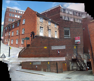
Here are my second series of photosynths depicting Lincoln Cathedral in various states of deconstruction. The synthed photo works remind me of scenes from Vertov’s Man with a Movie Camera where architectures is divided by trick cinema photography
Some of these examples look cubist, but there is an element of dynamism that we would see in futurism. The above image is too extremely distorted and splayed for my purposes. However, some elements of the juxtaposition are quite interesting. This software does come up with some very odd combinations.
The above start to look like a fusion of medieval architectecture and constructivism: Matta-Clark as a medieval anarchist perhaps or Protestand reformer. from the days of the Reformation.
A Medieval Malevich?
Subscribe to:
Comments (Atom)


