Tuesday 30 March 2010

The Fathers of Computer Graphics


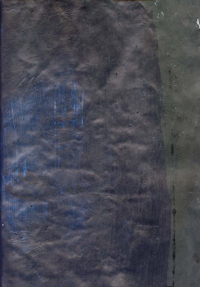
James Whitney Lapis 1966


The Whitney Brother's John (1917-95) and James (1921-82) were key pioneers of independent American animation. They were important “for laying the groundwork for the whole field of computer animation and digital special effects” (Beck, 2004 p. 216).

John Whitney studied 12-tone music and animation of abstract design in Paris in 1937-38. On returning to the United States he joined his brother James who was a painter and produced their first film, Twenty-Four Variations (1940) an 8mm abstract film that used circles and triangles. For the production John Whitney built his own optical printer. From 1940-45 they produced five abstract film exercises. John Whitney significantly created sound directly onto film, a technique later developed by Norman McLaren (Beck, 2004 p. 216).

John Whitney went on to found Motion Graphics, Inc in 1952 to produce commercial films. Then he moved to the UPA to become a director in 1955 and then worked at the Charles and Ray Eames Studio and designed the title sequence for Alfred Hitchcock’s Vertigo with  Saul Bass (I assume) in 1958 (Beck, 2004 p. 216).


In 1959 John Whitney began to use a World War II gun sight (designed by Norbert Wiener?) which essentially was a simple analogue computer, to help produce simple visual effects (Beck, 2004 p. 216)..


The film Lapis, “is named after the philosophers stone in practice of alchemy and encourages notions of contemplation and a fuller understanding of the place of humankind with the cosmos” (Wells, 1998 pp. 30-31).


Sources:


Beck, J., (2004) Animation Art: From Pencil to Pixel, The History of Cartoon, Anime and CGI London: Flame Tree Publishing.

Wells, P., (1998) Understanding Animation London and New York: Routledge


Further reading:


LeGrice, M. (1977) Abstract Film and Beyond, Cambridge, Mass and London: MIT Press.

Russett, R., and Star, C., (1976) Experimental Animation: An illustrated Anthology New York: Van Nostrum Reinhold.


John Whitney Sr. Homepage: http://www.siggraph.org/artdesign/profile/whitney/whitney.html

Monday 29 March 2010

Abstract Cinema 7: Norman McLaren


"For myself, indeed, with an abstract film, the most pleasing forms are those which come closest to music. There must be visual equivalence"
Norman McLaren.

The above film Begone Dull Care (1949) was produced partly through the painting of the visuals onto 35mm clear film, frameless and frame by frame. Other imagery were etched directly into 35mm film.

The film features a soundtrack by Oscar Peterson


Abstract Cinema 6: Harry Smith


— Short animations by Harry Smith.
No. 1: A Strange Dream (l946)
No. 2: Message from the Sun (1946-48)
No. 3: Interwoven (1947-49) (Part 1)


Abstract film, especially where colour is concerned owes a lot formally to the work of Kandinsky. Malcolm Le Grice makes some interesting comparisons between works like The Battle from 1910 and Harry Smith’s Film Number 3 done before 1950. "Kandinsky's work" argues Le Grice "not only explores the notion of shape transformations, or colour changes within repeated shapes, but also shape repetitions which imply movement either across the surface or into the 'space' of the picture" ( 1977, p.77).
 Further reading:

LeGrice, M. (1977) Abstract Film and Beyond, Cambridge, Mass and London: MIT Press.


Russett, R.and Starr, C. (1976) Experimental Animation: An Illustrated Anthology, New York: Van Nostrand.


Abstract Cinema 5: Len Lye


A number of the film makers and animators featured throughout this blog are represented because of their work of abstract nature. I do not think that I am a colourist or influenced directly by animators like Len Lye. The colour seems extracted from that of Gaugain alongside the brightness and ecstasy of Matisse and the Fauves.


Lye’s first film was Tusalava, but his first camera-less film was Colour Box (1935) “considered to be the first animation film painted directly on film and shown to general audiences” (Russet and Starr, 1976 p. 65). Colour Box was produced for the G.P.O.


The non-objective and non-linear nature of Colour Box “is created with lines and shapes stencilled directly on to celluloid, changing colour and form throughout its five duration” (Wells, 1998 p. 46). The film is made up of lines which dominate throughout alongside “circles, triangles and grids interrupting and temporarily joining the image, until it reveals its sponsors, the G.P.O Unit, by including various rates of parcel post” (Wells, 1998 p. 46).


The films modernity was not just expressed in its imagery, but also in its use of “a contemporary jazz-calypso score” (Wells 1998, p.46). Lye’s modernity lay also in the way in which his films pointed to the future, not the future it seems of animation or film, but that of painting. It is interesting to note that “Lye adapted the free brush work and wax-resist techniques he had developed in his batik paintings” that allowed him “to paint directly onto clear 35 mm film” (Watson, 1997 p.48). The result is gestural and “calligraphic” (LeGrice, 1977 p. 771) an effect closer to the aesthetics of the action painters like Kline or the more abstract de Kooning.


Sources:


Beck, J., (2004) Animation Art: From Pencil to Pixel, The History of Cartoon, Anime and CGI London: Flame Tree Publishing.


LeGrice, M. (1977) Abstract Film and Beyond, Cambridge, Mass and London: MIT Press.


Russett, R.and Starr, C. (1976) Experimental Animation: An Illustrated Anthology, New York: Van Nostrand.

Watson, P., (1997) "True Lye's: (Rem)Animating Film Studies" in Art and Animation: Art and Design Vol 12 No. 3/4 March-April 1997 pp. 46-49. 
Wells, P., (1998) Understanding Animation London and New York: Routledge


Further reading:


Kostelanetz, R., (2001) Dictionary of Avant-gardes 2nd Edition, New York and London: Routledge.

Leslie, E., (2002) Hollywood Flatlands: Animation, Critical Theory and the Avant-garde, London and New York: Verso.

Abstract Cinema 4: Oskar Fishinger


Above: Abstractions 1946-57.

Oskar Fishinger is often seen as the pioneer of abstract animation. Jerry Beck suggests that “Fishinger had always had a dream of blending classical music with the kind of conceptual designs that might be formulated in one’s mind when listening to a symphony. This mixture he termed as ‘visual music’” (Beck, 2004, p.22).

Fishinger’s ability in blending music with animation inspired the animators on Walt Disney’s Fantasia (1941). He did work on the “Toccata and Fugue” (Bach) section, but “because his original designs were dismissed as too abstract and modified against his wishes, Fishinger acquired a deserved reputation as an animator with more integrity than Disney” (Kostelanetz, 2001 p.213). Fantasia can be seen as “Disney’s attempt to legitimise the animated film by working in a more abstract, highly aesthetic supposedly ‘cultured’ way" (Wells, 1998 p. 29)


Further reading:

Beck, J., (2004) Animation Art: From Pencil to Pixel, The History of Cartoon, Anime and CGI London: Flame Tree Publishing.
Kostelanetz, R., (2001) Dictionary of Avant-gardes 2nd Edition, New York and London: Routledge.
Leslie, E., (2002) Hollywood Flatlands: Animation, Critical Theory and the Avant-garde, London and New York: Verso.
Russett, R.and Starr, C. (1976) Experimental Animation: An Illustrated Anthology, New York: Van Nostrand.
Wells, P., (1998) Understanding Animation London and New York: Routledge

A Note on Abstract Expressionism

Abstract Expressionism has been mentioned on a number of occasions throughout this blog. It is perhaps America’s stand against other media. The purity argued by Clement Greenberg is interesting, but at this moment I favour something anti-formalist.


I take pleasure in John Squire’s exuberant appropriation of Pollock or Ralph Rucci’s homage to Cy Twombly.

John Squire, Bye Bye Badman, 1988, oil on canvas


Cy Twombly Untitled 1970


"Twombly Swan" white silk gazar gown with embroidery and beading by Lesage
Chado Ralph Rucci, Ready-to-wear spring/summer 2002
Collection of Ralph Rucci


I am drawn to abstract expressionisms scale and grandness: scalessness? It is also its all overness that is also very effective in both painting and photography: a wholeness of gesture.


Saturday 27 March 2010

Abstract Cinema 3: Hans Richter


Hans Richter is still an important chronicler of the Dada movement. His first-hand account of Dada, Dada: Art and Anti Art still stands today as an important document despite it’s the silly and appalling treatment of Hannah Höch. It’s a book that still appears on many a reading list in art schools today.


Hans Richter’s Rythmus 21 is an important early abstract film. It sometimes, quite wrongly apparently, referred to as the first abstract film.


According to Esther Leslie, Richter’s “abstract films were conceived as a light-play of positive and negative” (Leslie, 2002p.37). Leslie compares Richter to Malevich in his aim to “reduce form to its simplest element”, which Richter claimed “to be the rectangle or square” (p.37). However, she points out that unlike Malevich and others, there was no “assumed metaphysical importance” to these elements (p.37).


Sources:

Leslie, E., (2002) Hollywood Flatlands: Animation, Critical Theory and the Avant-Garde, London and New York: Verso.

Abstract Cinema 2: Viking Eggeling (1880-1925)


Eggeling was an early contributor to the Dada movement. In collaboration with Hans Richter he worked on abstract picture scrolls. The works are notable shift in (Zurich) Dada’s aesthetics away from Expressionism towards Constructivism. Although it can be argued that historically “the impetus for the production of the first abstract film seems to come from music and paintings rather than cinematography” stimulated by the “Blaue Reiter almanac’s call for a theory of painting” (Lynton, 2003, p. 119).

Eggeling was concerned with “‘rhythm in painting’ through all the possible permutations of certain linear and spatial relationships” (Kostelanetz, R., 2001, p. 189): “a general concern for line and surface” (Michaud, 1996, p.23). Above is the classic Diagonal Symphony from 1924, in which Eggeling produced more than a thousand drawings on his own.


Bibliography:

Kostelanetz, R., (2001) Dictionary of Avant-gardes 2nd Edition, New York and London: Routledge.

Lynton, N., (2003) The Story of Modern Art, London and New York: Phaidon.

Michaud, Philippe-Alain, (1961) “The Haunting of the Subject on Dada Cinema”, in (2005) Dada Cinema, Paris: Re: Voir Video.

Wednesday 24 March 2010

Mark Rothko

Simon Schama on Rothko:

"One morning in the spring of 1970, I went into the Tate Gallery and took a wrong, right turn and there they were, lying in wait. No it wasn't love at first site. Rothko had insisted that the lighting be kept almost pretentiously low. It was like going into the cinema, expectation in the dimness. Something in there was throbbing steadily, pulsing like the inside of a body part, all crimson and purple. I felt I was being pulled through those black lines to some mysterious place in the universe. Rothko said his paintings begin an unknown adventure into an unknown space. I wasn't sure where that was and whether I wanted to go. I only know I had no choice and that the destination might not exactly be a picnic, but I got it all wrong that morning in 1970. I thought a visit to the Seagram Paintings would be like a trip to the cemetery of abstraction - all dutiful reverence, a dead end. Everything Rothko did to these paintings - the column-like forms suggested rather than drawn and the loose stainings - were all meant to make the surface ambiguous, porous, (and) perhaps softly penetrable. A space that might be where we came from or where we will end up. They're not meant to keep us out, but to embrace us; from an artist whose highest compliment was to call you a human being."
BBC:
http://www.bbc.co.uk/arts/powerofart/rothko.shtml


Black on Maroon, 1959


Rothko reached his mature style around 1949 and the early nineteen fifties. Rothko’s work features “large hand-shaped rectangles, usually staked one above the other, together filling nearly the entire field of the canvas”, with each rectangle having “slightly different hues, while the background color (sic) differs only a little more from that of the rectangles” (Kostlanetz, R., 2001 p.530). Rothko’s work can be seen as an important precursor to monochromatic painting that we have seen since the nineteen sixties and seventies, which explore “surface tensions, color (sic) relationships and ways of negating suggestions of ‘depth’” (p.530).

No 14, 1960.


Rothko was part of the “theological” wing of the abstract expressionists. He was “obsessed with the moral possibility that his art could go beyond pleasure and carry the full burden of religious meanings- the patriarchal weight, in fact, of the Old Testament” (Hughes, R., 1991 p.322-323). His attempt to fulfil this ambition culminated in a series of paintings from 1964-7, commissioned by the de Menil family as “the objects of contemplation” in a non-denomination chapel attached to Rice University (p. 323).


Centre Tryptich for Rothko Chapel, 1966, Houston


The monochromatic paintings have “all the world…drained out of them, leaving only a void”: the Rothko Chapel therefore represents "the last silence of Romanticism” (Hughes, R., 1991 p. 323).


Bibliography:

Hughes, R., (1991) The Shock of the New, London: Thames and Hudson.

Kostelanetz, R., (2001) Dictionary of the Avant-Gardes, New York & London: Routledge.

Schama, S. & BBC, Simon Schama on Rothko: Available from World Wide Web: http://www.bbc.co.uk/arts/powerofart/rothko.shtml [last accessed 24/03/10].


Braque


Le Guéridon


Le jour (1929)


L'Atelier III, 1949


The Classicism of Braque’s painting of the twenties and thirties and beyond are interesting for a number of reasons. The works “reactionary nature” is connected to Braque’s “collapse into calm” (Wheeler,D., p.64). The works representation of calm is partly due to the process of the “reassembly” of the still-life tradition that Cubism “helped to shatter” (Hughes, 1991 p. 146). His subject was the studio. For Braque “the studio is a sanctum, imagination’s cave, and its clutter of bottles, pots and oddities suggests the alchemists cell with its alembics and stuffed crocodile” (Hughes, 1991, pp. 146-49). The studio or at least the image of it is one of “a privileged place of transmutation, memory and contemplation… the key to the paintings of Braque’s old age, the Ateliers of 1949-54, with their calm transparency and baffling layers of images” (Hughes, 1991 p. 146).

A further discussion on Braque is available here.

Sources:
Hughes, R., (1991)
Shock of the New, London: Thames and Hudson.
Wheeler, D., (1991)
Art since Mid-Century, London: Thames and Hudson.

Current Developments: 9

Works: 2009-10

The use of real substances: glue papers and paints have purpose. Oddly, Braque seems to be someone of importance in relation to this use of substances in the case collage and paint.


The use of real substances: glue papers and paints have purpose. Oddly, Braque seems to be someone of importance in relation to this use of substances in the case collage and paint.


His still lives of the twenties and thirties offer some solutions to the problems of digital imaging. “Post Cubism”, Braque remarked, “There is in Nature, a tactile, I almost mean ‘manual’ space” (Hughes, R., 1991 p.146). Braque’s aims are interesting. His shift away from “Cubist uncertainty” towards “the structure of calm, overlapping planes and transparencies” (p.146) was a manifestation of his desire for the spectator’ attention to be evenly distributed across the painting. To further achieve this he “took to mixing sand with his paint to give it more body, a more resistant surface, like fresco” (p.146): Braque’s aim to slow down the eye.


The use of collage in the digital images is an attempt to develop a mysterious, silent and sometime grainy surface that “insists on gradual inspection” and “immense deliberation” to the act of seeing (p.146)


The digitization of the collage and the overlaying of images on its surface give substance and weight to the final imagery, while the unification of media is a deliberate attempt to slow down the act of looking.


The choppy surfaces recall Jasper John’s paintings and Rauschenberg’s early abstractions. However, the style and surface of the pictures are more in tune with Abstract Expressionism and Surrealist automatism that led to its development.


I have been looking at the cool abstractions of Ad Reinhardt, but it seems to be Motherwell whose collages and collage paintings that have affected me more at the moment. The dominance of black in the work does echo Motherwell and Reinhardt.


Some of the imagery recalls Clyfford Still and Barnett Newman's canvases, albeit in a very casual way.


Of course the work re-presented here is sometimes terribly clumsy and nowhere near in quality to the classicism of Braque. I remember after one presentation I gave Adam O’Mera made reference to Malevich, when discussing my work. To paraphrase a critic’s description of Franz Kline work, some of the “painting” shown here are like melted Malevich’s.


The result is the production of some useful textures and shapes that can sustain numerous applications of layers via Photoshop. Some give a subtle texture to the imagery that can be emphasized or disappear via the use of filters and the montage effects on the computer.


Bibliography:

Hughes, R., (1991) Shock of the New, London: Thames and Hudson.


Monday 22 March 2010

William Latham Interview


This is an interview from a documentary series called Secret Passions, from Channel 4 in the early nineties.

Sunday 21 March 2010

William Latham

Hopefully in the course of writing this blog I have shown the relevance of abstraction to my own practice. Michael Rush in his book New Media in art shows us that "abstraction is still very much alive in computer art" (2005, p. 209). William Latham's Evolution of Form is a "computer sculpture" that draws its inspiration from complex natural forms like seashells and the work of "Surrealist painters Salvador Dali and Yves Tanguy in his quest for forms that can be manipulated, reshaped (or 'carved', in virtual sculpture within the computer (2005, p. 211).

Rush claims that "Latham was amongst the first to create genetically alive forms that resemble living organisms, though there mutations only occur inside the computer (2005, p. 210)


Clip from The Evolution of Form, by William Latham and Stephen Todd, from 1989; work done at IBM UK Research Labs. Details of sotware can be found in the book: Evolutionary Art and Computers, Academic Press, 1992.

Latham and Todd have now joined Frederic Fol Leymarie (since 2006) at Goldsmiths College, University of London, and created the Mutators Research Group: http://www.mrg-gold.com


Was presented at SIGGRAPH'94 and Imagina'93 (funded by the British Arts Council and Channel 4). The sound track is from Michel Redolfi (www.audionaute.com) famous for his underwater music.

Biogenesis shows the evolution of artificial life forms in a synthetic universe where 'survival of the fittest' is replaced by 'survival of the most aesthetic'. We see cellular evolution and the replication of mutations forming chain-like structures resembling coral. The artist is like a gardener, breeding, selecting, marrying and steering the course of evolution for creative ends. The film is a record of this evolutionary process. It can be viewed as a psychedelic experience or a more subtle parody of a man's relationship with the natural world through modern technology.

This line of work is being pursued by the MRG group at Goldsmiths College in London, led by Latham, Todd, Fol Leymarie et al. (www.mrg-gold.com).

Saturday 20 March 2010

Web 3.0: Nigel Coates, Architect, Author and Designer


First minutes of Nigel Coates, Head of Architecture at the RCA, participation on the STIR lecture; Web 3.0: Materializing the conceptual worlds of the mind.

Web 3.0: Materializing the conceptual worlds of the mind


Highlights of STIR lecture - Web 3.0:
Irving Wladawsky-Berger, Chairman Emeritus IBM Academy of Science with John Maybury, Film Director and Nigel Coates, Architect, Author and Designer. In this evening's lecture we explored the cross over between real and virtual worlds in the worlds of cinema, architecture and information technology. For more information including full lenght videos visit www.designlondon.net/news&events

John Maybury

First minutes of John Maybury participation on the STIR lecture; Web 3.0: Materializing the conceptual worlds of the mind. 


Friday 19 March 2010

Daily Mail-o-matic

Political In-Correctness Gone Mad:

http://www.qwghlm.co.uk/toys/dailymail/

A Note on Criticism: 3


From Criticizing Photographs
An Introduction to Understanding Images by Terry Barrett from pages 1- 2
"...This book is about reading and doing photography criticism so that you can better appreciate photographs by using critical processes. Unfortunately, we usually don't equate criticism with appreciation because in everyday language the term criticism has negative connotations: It is used to refer to the act of making judgments, usually negative judgments, and the act of expressing disapproval. In mass media, critics are portrayed as judges of art: Reviewers in newspapers rate restaurants with stars, and critics on television rate movies with thumbs up or thumbs down or from 1 to 10, constantly reinforcing judgemental aspects of criticism. Of all the words critics write, those most often quoted are judgements: "The best play of the season!" "Dazzling!" “Brilliant!" These are the words highlighted in bold type in movie and theatre ads because these words sell tickets. But they comprise few of the critic’s total output of words, and they have been quoted out of context. The value of these snippets for our reaching an understanding of a play or a movie is minimal. Critics are writers who like art and choose to spend their lives thinking and writing about it".

Char Davies: Ephemere