Showing posts with label abstraction. Show all posts

Monday, 20 June 2011

Jayne Jones: New work and New Exhibition 'Material Matters" 22 June-30 July, 2011


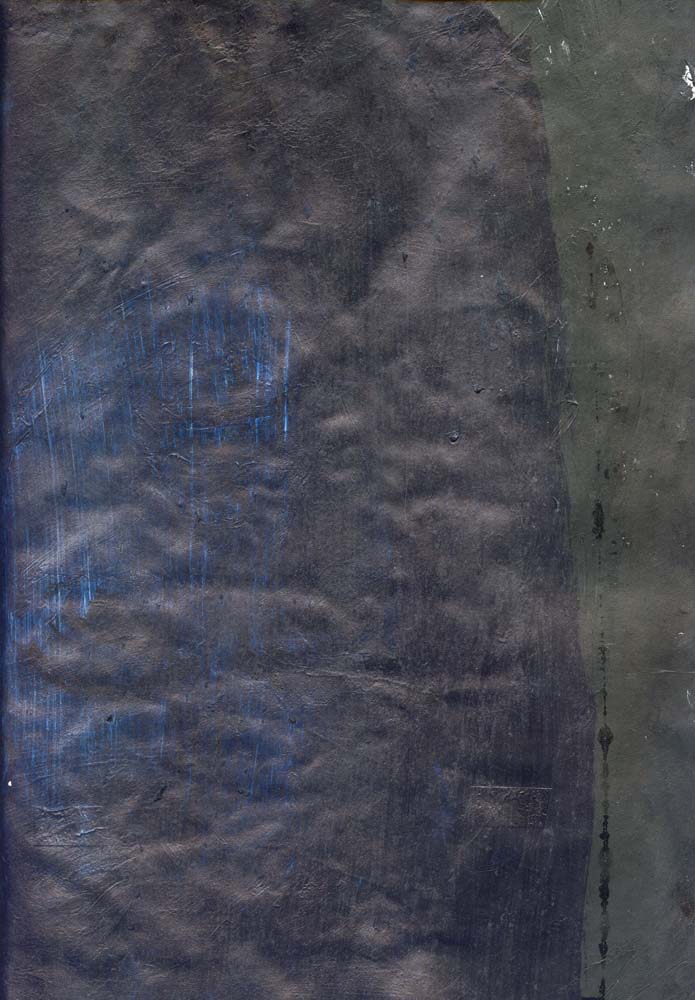
 Jayne Jones - Our greater Scheme for Happness - Mixed Media on Canvas - Size 90cm x 90cm

The artist Jayne Jones has a new show of abstract paintings at the Duckett & Jeffrys Gallery in Malton from the 22nd June until 30th July. I have watched her style and approach develop from the early-mid nineties from mixed media/collage  to  acrylic and oil, to  industrial paint. These works featured here are produced using mixed media; oil pigment, industrial paint and resin.


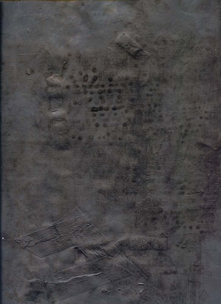
 Jayne Jones - Where Effort & Form Disappear - Mixed Media on Canvas - Size 400cm x 210cm


In the essay "Experiments in Painting"  by David Sweet he states that Jayne's interest in experimentation "stems from her interest in material processes that involve chance and unpredictable outcomes" (Sweet, D, ND).


Helen Frankenthaler, Mountains and Sea (1952)


Alpha-Pi, 1960
Morris Louis (American, 1912–1962)
Acrylic on canvas

102 1/2 x 177 in. (260.4 x 449.6 cm)


Puddle Painting: Mars Black
Ian Davenport 2009
40 1/2 x 31 in / 103 x 79 cm
acrylic paint on aluminium, mounted on aluminium panel


This is what was said of her work at the James Freeman Gallery: "while her practice is strongly indebted to important figures in abstraction such as Ian Davenport and Morris Louis, Jayne Jones articulates these references with a very feminine, and sometimes sensual, undercurrent that makes her work distinctive – many of the more figurative suggestions that seem to randomly appear as a result of her process seems to cohere around ideas of womanhood, which in turn makes an initially impersonal approach to painting seem extremely personal and private. In this respect her work contributes to the cannon of process painting, which is a result of her sustained commitment to experimentation and exploration in the medium".

Is her work closer then to the colour field painting of say Helen Frankenthaler?


Duckett & Jeffreys Gallery
2 Old Maltongate
Malton
YO17 7EG


http://www.duckettandjeffreys.com/

Monday, 11 April 2011

Abstraction and Photography: 3


After World War II photographic abstraction informed by the experiments of the New Bauhaus in Chicago became quite prominent in the United States.  Many of these developments coincided with the rise of Abstract Expressionism in post war American painting.


Represented here are some later examples of photographic abstraction by James Welling. He emerged in the '70s as an artist for whom photographic norms and the representational field itself were and remain contested and problematised.


James Welling Untitled, 1980 (P4)


James Welling 2-29 I (B15), 1980, Gelatin silver contact print 3½ x 4 in.


James Welling 2-29 II (B16), 1980 Gelatin silver contact print4 ⅝ x 3 ¾ in

Abstraction and Photography: 2

European photographers began to produce work nourished by cubism, abstraction and the Bauhaus aesthetic pioneered by Moholy-Nagy and El Lissitsky.  Members of the New Vision Group began to produce innovative compositions. Within the French avant-garde, photographers such as André Kertész and Florence Henri began to treat form in new ways.  Kertész produced work like Shadow of the Eiffel Tower, 1929. Henri would seek out the abstract within the concrete in work like Abstract Composition (handrail) 1930. Henri would also use mirrors to manipulate composition on form as in her work. One interesting example is Window, 1928-29. Jaromír Funke also used mirrors in his Photographic Constructions (1923).

Other methods of producing photographic abstractions were found by photographers. For example, Christian Schad, Moholy-Nagy and Man Ray produced photograms and influenced future production of photographic abstraction via cameraless photographic methods. 


André Kertész  Shadow of the Eiffel Tower, 1929.


Florence Henri  Window, 1928-29.


Jaromír Funke Photographic Constructions  1923.


Jaromír Funke Light Abstraction, 1927


Abstraction and Photography: 1

This is a subject that I should have discussed for project one since many of my posts deal with one kind of abstraction or another.  Pictorial abstraction is conventionally defined as “a work of art with no recognizable subject”. This seems totally at odds with nature of photography which is essentially realistic and representational/ figurative.

The two approaches that have explored include the exaggeration of single characteristics like subjects form or its texture. The other approach generally includes the use of extremes close-ups, distortions and lighting effects. These effects transform the subject in such a way as to make it unidentifiable.  Although not strictly photographic, project one included lighting effects, blurring and numerous references to abstract art.  Project 2, is more photographic, but the imagery is distorted and is often unidentifiable or at times difficult to identify and abstract in nature. Certainly with the automatic-joiners that project 2 have produced, the imagery shifts from the representational to the abstract. 


“From the moment Cubism emerged in Europe, around 1907-8, its radically stylized geometric shapes prompted photographers- who were also influenced by Japonisme, Constructivism, and Wassily Kandinsky’s of abstraction (1913)- to imitate what then seemed the essence of Modernism (Mora, G 1998, p.39).  


Alvin Langdon Coburn The New York Octopus 1912


Alvin Langdon Coburn was said to be the first to intentionally abstract photographs. Evidence of this can be found in his 1912 series New York from its Pinnacles. The New York Octopus is a good example. Although many would deny Cubism is abstraction, its stylization of reality led photographers like Coburn to experiment with light and refracted mirrors in 1916. These works were called vortographs by Wyndham Lewis one of the key figures of Vorticism. 


Alvin Langdon Coburn Vortograph 1917


In 1916, Paul Strand made abstracts such as Porch Shadows. These works in turn inspired Fancis Bruguier and members of the Japanese Camera Pictorialists of America. There was an eagerness to link their photography to the avant-garde that was emerging from Europe. 


Paul Strand. Porch Shadows, 1916. 


The move towards abstraction quickly shifted towards the figurative and the stylization of the human body. This approach was associated quite strongly with the Clarence H. White School of Photography. From 1914 many of the professors and students like Laura Gilpin, Paul Outerbridge  Jr., Karl Struss, Margaret Watkins    and  Bernard S. Horne would produce photography informed by experimental abstraction.


Bernard S. Horne Design - Princeton
1917 (ca) Gelatin silver print
11 7/8 x 9 15/16


Margaret Watkins The Clarence H. White School of Photography: Design for Marble Floor, "Blythswood," Glasgow 1919

The work of the staff and students =were often reproduced in the magazine Photo=Graphic Art.

Sources:

Mora, G., (1998) Photospeak,  New York: Abbeville Press.


Sunday, 6 March 2011

Peter Halley: 2


Peter Halley at Mary Boone, NYC (February 2010. Originally uploaded by ballenato63 on Feb 13, 2010.

Monday, 3 January 2011

Peter Halley


Peter Halley at Mary Boone, NYC (Sept 2009). Originally uploaded by ballenato63 on Sep 22, 2009

Monday, 28 June 2010

Wolfgang Tillmans

When going through the Saturday Guardian (26.06.10), I came across an article discussing the work Wolfgang Tillmans. He was an artist I had seemingly ignored despite the fact that he had a high profile: he did win the Turner Prize in 2000.


half page
Installation view, Regen Projects
October 23 - December 6, 2008


I was interested in the critical response Tillmans received, which was on the whole negative. It seemed at odds with our pluralistic times. Tillmans’ work, especially in the nineties “used magazines particularly the street style magazine i-D as one of his outlets for his pictures while exhibiting in contemporary art galleries in London, New York and Cologne” (Jobey 2010 p. 16). One can I think, without reading the reviews, understand Adrian Searle’s position, but I am surprised by Matthew Collings’ dismissal of Tillmans’ work.


 half page
Installation view, Regen Projects
October 23 - December 6, 2008

My own felling about Tillmans work is rather ambiguous. However, what drew my attention were his influences. Tillmans is quoted as saying that “all the art that touched me was lens-generated, like Richter, or Polke, Rauschenberg, Warhol” and “of course Dada and Kurt Schwitters” (Jobey 2010 p. 16).


 Silver Installation VII 2009

The Guardian reports on Tillmans’ shift towards abstraction. The production of large inject prints seems to be a bold move. The images he produced “have taken on a spectacular and seductive presence in his installations… like works of a latter-day abstract expressionist” (p.17).


Serpentine Gallery, London, 26 Jun - 29 Aug 2010

While part of his work “developed towards abstraction, another took a more political route” (p.17). In a series of collages titled Truth Study Center, Tillmans “drew attention to the exercise of power behind ideologies of Islamic fundamentalism, Catholicism, Capitalism” (p.17).
.


Serpentine Gallery, London, 26 Jun - 29 Aug 2010

He is quoted as saying “I know that this won’t change the world. But then again I think the most important  thing is to start doing something” (p.17)

Sources:


Jobey, J. (2010) "Wolfgang Tillmans: the lightness of being" The Guardian, Saturday 26 June 2010 

Monday, 29 March 2010

Abstract Cinema 7: Norman McLaren


"For myself, indeed, with an abstract film, the most pleasing forms are those which come closest to music. There must be visual equivalence"
Norman McLaren.

The above film Begone Dull Care (1949) was produced partly through the painting of the visuals onto 35mm clear film, frameless and frame by frame. Other imagery were etched directly into 35mm film.

The film features a soundtrack by Oscar Peterson


Abstract Cinema 6: Harry Smith


— Short animations by Harry Smith.
No. 1: A Strange Dream (l946)
No. 2: Message from the Sun (1946-48)
No. 3: Interwoven (1947-49) (Part 1)


Abstract film, especially where colour is concerned owes a lot formally to the work of Kandinsky. Malcolm Le Grice makes some interesting comparisons between works like The Battle from 1910 and Harry Smith’s Film Number 3 done before 1950. "Kandinsky's work" argues Le Grice "not only explores the notion of shape transformations, or colour changes within repeated shapes, but also shape repetitions which imply movement either across the surface or into the 'space' of the picture" ( 1977, p.77).
 Further reading:

LeGrice, M. (1977) Abstract Film and Beyond, Cambridge, Mass and London: MIT Press.


Russett, R.and Starr, C. (1976) Experimental Animation: An Illustrated Anthology, New York: Van Nostrand.


Abstract Cinema 5: Len Lye


A number of the film makers and animators featured throughout this blog are represented because of their work of abstract nature. I do not think that I am a colourist or influenced directly by animators like Len Lye. The colour seems extracted from that of Gaugain alongside the brightness and ecstasy of Matisse and the Fauves.


Lye’s first film was Tusalava, but his first camera-less film was Colour Box (1935) “considered to be the first animation film painted directly on film and shown to general audiences” (Russet and Starr, 1976 p. 65). Colour Box was produced for the G.P.O.


The non-objective and non-linear nature of Colour Box “is created with lines and shapes stencilled directly on to celluloid, changing colour and form throughout its five duration” (Wells, 1998 p. 46). The film is made up of lines which dominate throughout alongside “circles, triangles and grids interrupting and temporarily joining the image, until it reveals its sponsors, the G.P.O Unit, by including various rates of parcel post” (Wells, 1998 p. 46).


The films modernity was not just expressed in its imagery, but also in its use of “a contemporary jazz-calypso score” (Wells 1998, p.46). Lye’s modernity lay also in the way in which his films pointed to the future, not the future it seems of animation or film, but that of painting. It is interesting to note that “Lye adapted the free brush work and wax-resist techniques he had developed in his batik paintings” that allowed him “to paint directly onto clear 35 mm film” (Watson, 1997 p.48). The result is gestural and “calligraphic” (LeGrice, 1977 p. 771) an effect closer to the aesthetics of the action painters like Kline or the more abstract de Kooning.


Sources:


Beck, J., (2004) Animation Art: From Pencil to Pixel, The History of Cartoon, Anime and CGI London: Flame Tree Publishing.


LeGrice, M. (1977) Abstract Film and Beyond, Cambridge, Mass and London: MIT Press.


Russett, R.and Starr, C. (1976) Experimental Animation: An Illustrated Anthology, New York: Van Nostrand.

Watson, P., (1997) "True Lye's: (Rem)Animating Film Studies" in Art and Animation: Art and Design Vol 12 No. 3/4 March-April 1997 pp. 46-49. 
Wells, P., (1998) Understanding Animation London and New York: Routledge


Further reading:


Kostelanetz, R., (2001) Dictionary of Avant-gardes 2nd Edition, New York and London: Routledge.

Leslie, E., (2002) Hollywood Flatlands: Animation, Critical Theory and the Avant-garde, London and New York: Verso.

Abstract Cinema 4: Oskar Fishinger


Above: Abstractions 1946-57.

Oskar Fishinger is often seen as the pioneer of abstract animation. Jerry Beck suggests that “Fishinger had always had a dream of blending classical music with the kind of conceptual designs that might be formulated in one’s mind when listening to a symphony. This mixture he termed as ‘visual music’” (Beck, 2004, p.22).

Fishinger’s ability in blending music with animation inspired the animators on Walt Disney’s Fantasia (1941). He did work on the “Toccata and Fugue” (Bach) section, but “because his original designs were dismissed as too abstract and modified against his wishes, Fishinger acquired a deserved reputation as an animator with more integrity than Disney” (Kostelanetz, 2001 p.213). Fantasia can be seen as “Disney’s attempt to legitimise the animated film by working in a more abstract, highly aesthetic supposedly ‘cultured’ way" (Wells, 1998 p. 29)


Further reading:

Beck, J., (2004) Animation Art: From Pencil to Pixel, The History of Cartoon, Anime and CGI London: Flame Tree Publishing.
Kostelanetz, R., (2001) Dictionary of Avant-gardes 2nd Edition, New York and London: Routledge.
Leslie, E., (2002) Hollywood Flatlands: Animation, Critical Theory and the Avant-garde, London and New York: Verso.
Russett, R.and Starr, C. (1976) Experimental Animation: An Illustrated Anthology, New York: Van Nostrand.
Wells, P., (1998) Understanding Animation London and New York: Routledge

Saturday, 27 March 2010

Abstract Cinema 3: Hans Richter


Hans Richter is still an important chronicler of the Dada movement. His first-hand account of Dada, Dada: Art and Anti Art still stands today as an important document despite it’s the silly and appalling treatment of Hannah Höch. It’s a book that still appears on many a reading list in art schools today.


Hans Richter’s Rythmus 21 is an important early abstract film. It sometimes, quite wrongly apparently, referred to as the first abstract film.


According to Esther Leslie, Richter’s “abstract films were conceived as a light-play of positive and negative” (Leslie, 2002p.37). Leslie compares Richter to Malevich in his aim to “reduce form to its simplest element”, which Richter claimed “to be the rectangle or square” (p.37). However, she points out that unlike Malevich and others, there was no “assumed metaphysical importance” to these elements (p.37).


Sources:

Leslie, E., (2002) Hollywood Flatlands: Animation, Critical Theory and the Avant-Garde, London and New York: Verso.

Abstract Cinema 2: Viking Eggeling (1880-1925)


Eggeling was an early contributor to the Dada movement. In collaboration with Hans Richter he worked on abstract picture scrolls. The works are notable shift in (Zurich) Dada’s aesthetics away from Expressionism towards Constructivism. Although it can be argued that historically “the impetus for the production of the first abstract film seems to come from music and paintings rather than cinematography” stimulated by the “Blaue Reiter almanac’s call for a theory of painting” (Lynton, 2003, p. 119).

Eggeling was concerned with “‘rhythm in painting’ through all the possible permutations of certain linear and spatial relationships” (Kostelanetz, R., 2001, p. 189): “a general concern for line and surface” (Michaud, 1996, p.23). Above is the classic Diagonal Symphony from 1924, in which Eggeling produced more than a thousand drawings on his own.


Bibliography:

Kostelanetz, R., (2001) Dictionary of Avant-gardes 2nd Edition, New York and London: Routledge.

Lynton, N., (2003) The Story of Modern Art, London and New York: Phaidon.

Michaud, Philippe-Alain, (1961) “The Haunting of the Subject on Dada Cinema”, in (2005) Dada Cinema, Paris: Re: Voir Video.

Wednesday, 24 March 2010

Current Developments: 9

Works: 2009-10

The use of real substances: glue papers and paints have purpose. Oddly, Braque seems to be someone of importance in relation to this use of substances in the case collage and paint.


The use of real substances: glue papers and paints have purpose. Oddly, Braque seems to be someone of importance in relation to this use of substances in the case collage and paint.


His still lives of the twenties and thirties offer some solutions to the problems of digital imaging. “Post Cubism”, Braque remarked, “There is in Nature, a tactile, I almost mean ‘manual’ space” (Hughes, R., 1991 p.146). Braque’s aims are interesting. His shift away from “Cubist uncertainty” towards “the structure of calm, overlapping planes and transparencies” (p.146) was a manifestation of his desire for the spectator’ attention to be evenly distributed across the painting. To further achieve this he “took to mixing sand with his paint to give it more body, a more resistant surface, like fresco” (p.146): Braque’s aim to slow down the eye.


The use of collage in the digital images is an attempt to develop a mysterious, silent and sometime grainy surface that “insists on gradual inspection” and “immense deliberation” to the act of seeing (p.146)


The digitization of the collage and the overlaying of images on its surface give substance and weight to the final imagery, while the unification of media is a deliberate attempt to slow down the act of looking.


The choppy surfaces recall Jasper John’s paintings and Rauschenberg’s early abstractions. However, the style and surface of the pictures are more in tune with Abstract Expressionism and Surrealist automatism that led to its development.


I have been looking at the cool abstractions of Ad Reinhardt, but it seems to be Motherwell whose collages and collage paintings that have affected me more at the moment. The dominance of black in the work does echo Motherwell and Reinhardt.


Some of the imagery recalls Clyfford Still and Barnett Newman's canvases, albeit in a very casual way.


Of course the work re-presented here is sometimes terribly clumsy and nowhere near in quality to the classicism of Braque. I remember after one presentation I gave Adam O’Mera made reference to Malevich, when discussing my work. To paraphrase a critic’s description of Franz Kline work, some of the “painting” shown here are like melted Malevich’s.


The result is the production of some useful textures and shapes that can sustain numerous applications of layers via Photoshop. Some give a subtle texture to the imagery that can be emphasized or disappear via the use of filters and the montage effects on the computer.


Bibliography:

Hughes, R., (1991) Shock of the New, London: Thames and Hudson.