Showing posts with label Collage. Show all posts

Monday, 11 July 2011

John Stezaker

John Stezaker once said “so much emerges from what I destroy” (Buck, L., 2011 p.36).  This could have come from the mouth of Gordon Matta-Clark. Stezaker’s collages seem to come out of the surrealist imagination: they are fragmentary and dream-like and created from found images. These dream-like and unsettling narratives drew from film stills, glamorous publicity shots from the golden age of Hollywood and postcards. 


  John Stezaker Untitled (For Angus) Film Still Collage II, 2009  


Old Mask IV 2006


Mask XXXV, 2007


Carla Sorell notes that “in the Mask series old portraits are mixed with found postcards, placed precisely over the face in such a way that the void created by the landscape become somehow representative of the subjects psyche” (Sorrell, C., 2011 p.21).


Sources:


Buck, L., (2011), “So much emerges from what I destroy” Art Newspaper 20 No220 Jan 2011 p.36


Sorrel, C (2011) “The Face Beneath” Crafts no228 Ja/F p.20-21

Thursday, 5 May 2011

David Hockney


 Don and Christopher, Los Angeles, 6th March 1982


David Hockney’s work shows an infatuation with the Polaroid, which led him to “re-explore the riches of the space-time equation investigated by Braque and Picasso in Analytical Cubism” (Wheeler, 1991 p. 159).


     Photographing Annie Leibovitz While She Is Photographing Me, 1982
photographic collage, 25 7/8 x 61 3/4 in.


In a conversation between David Hockney and Paul Joyce they explore the way in which technology influences the way we see:

Paul Joyce: So called reality accords with a programmed way of looking which goes back to what you were saying earlier, that the photograph has influenced the way we look. If we are presented with a photograph we say: well, that’s life. But it may not only be still photog4raphers that are responsible for that. Movies have influenced our way of seeing as well, but they are not life at all. They show a world confected, glamorized, changed.


Still Life Blue Guitar, 1982  composite polaroid, 24 1/2 x30 in.


Mother, Bradford Yorkshire 1982, composite polaroid, 56x23 1/2

David Hockney: I do think it’s true that all depictions must be stylized, what we call stylized. There is no way they can’t be. After all, they are not really reality. They are put on a flat surface as stylizations of some kind.

Listen to this [quotes from Leo Steinberg*]

Surveying Picasso’s lifelong commitment to women as solid reality - a commitment relaxed only during the cubist episode – one arrives at a disturbing conclusion. That Picasso, the great flattener of the Twentieth Century painting has had to cope within himself with the most uncompromising three dimensional; imagination that ever possessed a great painter. And that he flattened the language of painting in the years just before World War I because the traditional means of 3D rendering inherited from the past were for him too one-sided , too lamely content with the exclusive aspect in other words- not 3-D enough.
Amazing, isn’t it! Picasso shows you both front and back, and this must be about memory because…

 
PJ: You must retain one when you are looking at the other. Of course, when we walk around in an object, such as a jacket that’s on a peg, we are also dealing with what we expect it to be like. We have seen a jacket before and our imagination and our memory are stimulated by something already seen and known.

 
*Other Criteria by Leo Sternberg (Oxford University Press, 1975).


Sources:

Joyce, P., (1988) Hockney on Photography London: Jonathan Cape
Wheeler, D., (1991) Art Since Mid-Century London: Thames and Hudson

Sunday, 3 April 2011

Picasso: Guitars 1912-1914 | Picasso's Collage Materials


Uploaded by on Mar 20, 2011
Find out more at http://MoMA.org/picassoguitars

Picasso: Guitars 1912-1914
On view February 13-June 6, 2011

Produced by CK Studios, Inc.

© 2011 The Museum of Modern Art, New York

Monday, 5 April 2010

Picasso's Collages


Pablo Picasso Guitar, Sheet Music, and Wine Glass 1912


As I work on my digital collages I am reminded of Clement Greenberg's essay on collage: "The Pasted-Paper Revolution" (or as it is known "On Collage"). Greenberg's article is still amazing. In it he discusses a number of cubist works by Braque and Picasso.

In the Autumn of 1912 Pablo Picasso began a series of works using a range of materials such as wallpaper, imitation wood grain, newspaper, a charcoal drawing
and sheet music. This is one (above) of the earliest collages and perhaps even the first.

Clement Greenberg in his "The Pasted-Paper Revolution" of 1958 argued that pictorial allusion gave way to what he called an optical illusion. In his sophisticated formalist reading of the work he argued that the various elements, the lettering, the charcoal lines and the coloured papers "begin to change places in depth with one another, and a process is set up in which every part of the picture takes its turn at occupying every plane, whether real or imagined, in it."


Art News 1958

Source:

Frascina, Francis and Harrison, Charles (1987) Modern Art and Modernism: A Critical Anthology New York: Harpers and Row pp.105-108.

Wednesday, 24 March 2010

Current Developments: 9

Works: 2009-10

The use of real substances: glue papers and paints have purpose. Oddly, Braque seems to be someone of importance in relation to this use of substances in the case collage and paint.


The use of real substances: glue papers and paints have purpose. Oddly, Braque seems to be someone of importance in relation to this use of substances in the case collage and paint.


His still lives of the twenties and thirties offer some solutions to the problems of digital imaging. “Post Cubism”, Braque remarked, “There is in Nature, a tactile, I almost mean ‘manual’ space” (Hughes, R., 1991 p.146). Braque’s aims are interesting. His shift away from “Cubist uncertainty” towards “the structure of calm, overlapping planes and transparencies” (p.146) was a manifestation of his desire for the spectator’ attention to be evenly distributed across the painting. To further achieve this he “took to mixing sand with his paint to give it more body, a more resistant surface, like fresco” (p.146): Braque’s aim to slow down the eye.


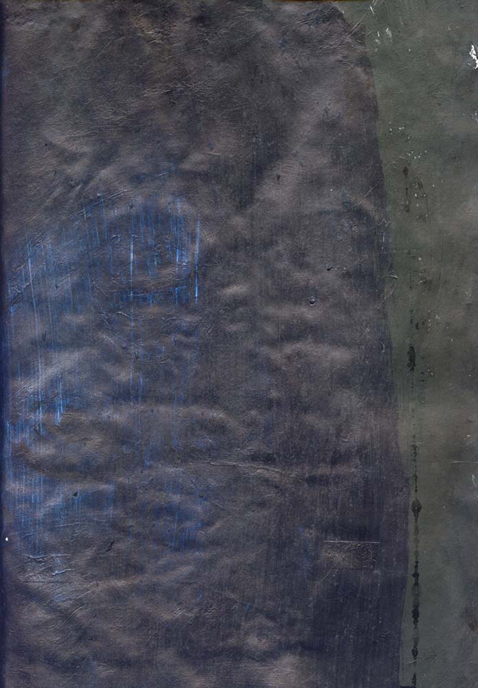
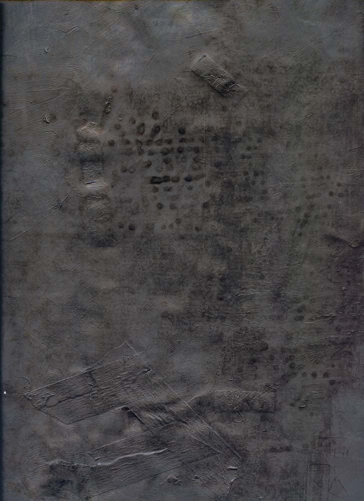
The use of collage in the digital images is an attempt to develop a mysterious, silent and sometime grainy surface that “insists on gradual inspection” and “immense deliberation” to the act of seeing (p.146)


The digitization of the collage and the overlaying of images on its surface give substance and weight to the final imagery, while the unification of media is a deliberate attempt to slow down the act of looking.


The choppy surfaces recall Jasper John’s paintings and Rauschenberg’s early abstractions. However, the style and surface of the pictures are more in tune with Abstract Expressionism and Surrealist automatism that led to its development.


I have been looking at the cool abstractions of Ad Reinhardt, but it seems to be Motherwell whose collages and collage paintings that have affected me more at the moment. The dominance of black in the work does echo Motherwell and Reinhardt.


Some of the imagery recalls Clyfford Still and Barnett Newman's canvases, albeit in a very casual way.


Of course the work re-presented here is sometimes terribly clumsy and nowhere near in quality to the classicism of Braque. I remember after one presentation I gave Adam O’Mera made reference to Malevich, when discussing my work. To paraphrase a critic’s description of Franz Kline work, some of the “painting” shown here are like melted Malevich’s.


The result is the production of some useful textures and shapes that can sustain numerous applications of layers via Photoshop. Some give a subtle texture to the imagery that can be emphasized or disappear via the use of filters and the montage effects on the computer.


Bibliography:

Hughes, R., (1991) Shock of the New, London: Thames and Hudson.


Saturday, 20 February 2010

Wednesday, 17 February 2010

Robert Motherwell


Motherwell was perhaps the youngest of the Abstract Expressionists; he was also their intellectual light, the most educated member of the group, the best travelled and most independent and the artist who was the most connected to the old European avant-garde. He immersed himself in modernist tradition. He especially loved French culture: I imaged that he smoked Gauloises (he did not, he liked the blue label and used it in his collages); he loved French literature: Mallarme, Rimbaud, Lautreamont, Proust and Baudelaire. His contact with surrealism was very important because it prompted Motherwell to paint and involve himself in developing his own for of automatic drawing and painting exercises, firstly with the artist Matta and then with Jackson Pollock.


Elegy to the Spanish Republic No. 34 1953-54.


Although an abstract painter, Motherwell’s work “constantly reaches out into life”: his Elegies
working as “general metaphors of the contrast between life and death and their interrelation" (Lynton, N., 2003 p. 243).


Iberia No. 18, 1958


In Plato's Cave No. 1 1972


Many of Motherwell's paintings rely on oppositions. He uses "the polarity between amphousness and geometry" to evoke "both opposition and ultimate harmony, as between nature and culture, emptiness thought, passivity and action- and on a larger scale, between chaos and cosmos" (Flam, J., 1991, p. 26-27). Paintings like Plato's Cave "seem to set emptiness against the mark of man (sic) in a way that recalls the oldest paintings known, those on the walls of prehistoric caves, especially the mysterious and moving pictographs on the walls of Lascaux and Altmira" (Flam, J., 1991, p. 27).


Summer Open with Mediterranean Blue 1974


Paintings like Summer Open are a manifestation of Motherwell's engagement with Matisse and matisse at his most sensual. The blue seems to reflect the light of Collioure, but a Collioure that this now a lost paradise, part of a Mediterranean culture that has vanished. Is it a nostalgic longing that we see in some of Motherwell's pieces?


Sources:


Flam, J., (1991) Motherwell, London and New York: Phaidon

Lynton, N., (2003) The Story of Modern Art, London and New York: Phaidon.


Tuesday, 16 February 2010

Robert Rauschenberg


Robert Rauschenberg Untitled (Glossy Black Painting), ca. 1951; painting; oil and paper on canvas.

The painting featured above is very similar to the pieces that I have been producing. However the aims of Rauschenberg's approach or at least some of the the results may be different. These early fifties pieces have influenced the making of the backgrounds to may digital imagery.


Retroactive I 1964


Kite 1963

The above pictures Kite 1963 and Retroactive I 1964 are Rauschenberg's view of the landscape of media. He essentially deals with glut: mass communication, mass media, and the noise of radio, cinema and television: the city full of signs: billboards, electronic data streams and the world of traffic and congestion. The idea of glut in the 1960s and in the 1980s seems miniscule in comparison with the glut of the net and the multi channels available to us: Google, MySpace, Facebook, Freeview, Sky, Virgin Media and whatever else exists.

What is interesting about these two works is that they seem to excavate the whole histories of media. Robert Hughes (1980 & 1991, pp. 345-6) has suggested that Retroactive showed how Rauschenberg like to excavate histories within a single image. The “red patch in the bottom right corner… is a silkscreen enlargement of a photo by Gjon Mili”, which Rauschenberg found in life magazine. According to Hughes Mili’s photograph was a carefully set-up parody of Duchamp’s Nude Descending a Staircase, 1912. “Duchamp’s painting was in turn based on Marey’s photos of a moving body. So…” according to Hughes “the image goes back through seventy years of technological time, through allusion after allusion; and a further irony is that, in its Rauschenbergian form, it ends up looking precisely like the figures of Adam and Eve expelled from Eden in Masaccio’s fresco for Carmine in Florence” (Hughes p. 346).


Above: Masaccio’s fresco from The Brancacci Chapel in the Church of Santa Maria del Carmine in Florence

Hughes, R. (1991) The Shock of the New: Art and the Century of Change London: Thames and Hudson.